This post recaps our presentation for the Search Discovery Education Community. Join to get this video and many more—for free!
What’s a data visualization funnel?
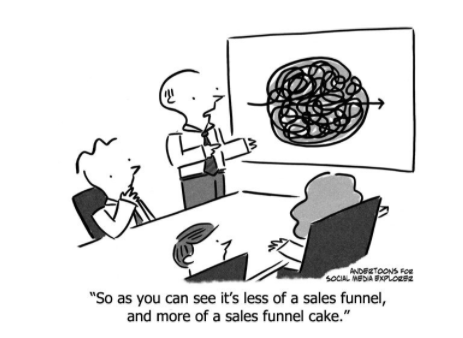
Any marketer who hears “funnel” is likely to envision an actual funnel. You know the kind— bigger at the top, skinny at the bottom, controls the downward flow of liquid into a more-restricted place. However, when a designer creates a digital user journey, it’s more like a colander situation: Data needs to flow in and out of it, not just through it. The data visualization, therefore, must reflect that design to be meaningful and helpful.
How to build a funnel plus build capabilities and skills
Noting this difference in how data practitioners think about funnels, this post is more than just a “how to build a funnel” tutorial. Information in this post can also be used to develop the capabilities and skills of the analyst in order to communicate a true understanding about what a funnel is, when and how it should be used, and what business impacts result from a properly designed funnel.
Funnel components
It’s important to understand the context around the data before being able to properly visualize it so that it will foster the proper interpretations. Funnel visualizations are no different. In particular, these types of visualizations require understanding around two data points before they can be effective, time and a designed process (which can also be called a path, journey, or experience).
The time element gives the frame of reference. Many digital marketing visualizations will include a time axis. In this case, time is a component of the overall scope of the data. This should be clearly shown and identified in the visual but should also be considered as a valuable constraint or limitation to proper understanding for the end user. Take, for instance, an ecommerce checkout funnel for a phone case. This type of journey will take much less time than a refrigerator checkout process. As pointed out earlier, the exit and entrance opportunities for the end user will need time to be incorporated. It is at this stage where the next key element becomes critical.
Understanding the expected steps in the process will help eliminate distractionary elements of a funnel visualization. Time is going to be limited or expanded based on the opportunities the end user has to exit and enter the process or journey. Unlike the time component, the expected user behavior is captured on the x axis of the funnel visualization. The value comes when you effectively incorporate and measure the entrance and exit points of the journey. This is why we like to call this type of funnel visualization a “fallout report” rather than a funnel visualization. This is also why this type of visual is important to have your analyst toolbox.
How to create a checkout funnel in Data Studio to understand flow and dropoff: A step-by-step guide
While the following steps will help you incorporate this visualization into Google Data Studio from the Google Merchandise Store Google analytics account, we know many of the skills you’ll learn in this process can be easily applied to many more user journey visualization opportunities.
For additional information regarding creating this type of visualization in Google Data Studio consider reading Chris Farina’s blog post which inspired much of our tutorial. You are certainly also going to want to check out this informative article by Michele Kiss and this helpful explanation of making sense of funnel visualizations by our own Tim Wilson a few years back.
And here we go! Feel free to follow along with our Data Studio Template. Make a copy of your very own.
Step 1: Connect your GA (either Free or 360) data to Data Studio
1. Create a New Report in DS
Select Google Analytics as Google Connector
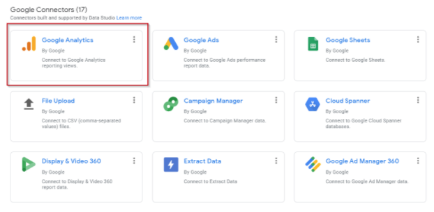
2. Click “Demo Account”
3. Click “Google Merchandise Store”
4. Click “1 Master View”

5. Click “Add”

Step 2: Format Shopping Stage values
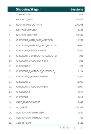
1. Click into existing table and replace dimension with “Shopping Stage” and metric with “Sessions”
2. Returns 22 values for Shopping Stage with various Session counts
Step 3: Filter to selected Shopping Stage values
1. Select “ADD A FILTER” in the DATA pane of the table card

2. Filter Shopping Stage Values using REGEX to exclude unnecessary steps:

3. Name Filter “Checkout Funnel Step Filter” and select “SAVE”

Additional Resource for Regular Expressions
Step 4: Further combine and remap Shopping Stage values
1. Select “ADD A FIELD” to create new Checkout Stage Dimension
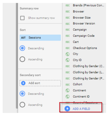
2. Create a calculated field to map and combine remaining values:
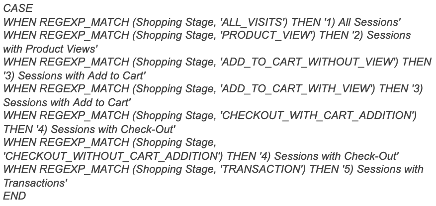
3. Name the new Field “Checkout Funnel Steps” and Select “SAVE”
Step 5: Switch to Calculated Dimension and Horizontal Stacked Column Chart
1. Replace “Shopping Stage” with the new calculated dimension and check that all 5 steps appear in the table
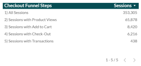
2. Select the table and change the Chart to a Column Chart, resize and style as needed
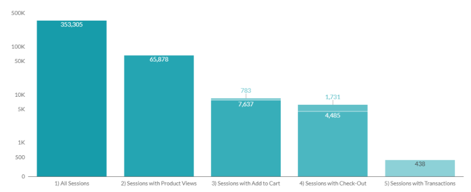
Step 6a: Create a new Blended Datasource to use for Drop off Percentages
1. Select a new Scorecard chart and select “Blend Data” from the Data Source section
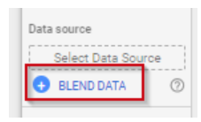
2. Add 5 datasource blends by selecting “Add Another Data Source” with Sessions as the datasource metric and no dimension selected for all 5 sources

3. Add filters for each step in the checkout process for each datasource
Ex: Datasource 1 filter:

4. Rename session metrics for each data source to match Bar values.Ex: Data source 1 value is “1) All Sessions”
Step 6b: Add drop off percentages
1. Using the newly saved blended datasource, create a calculated metric by selecting the “Create Field” option
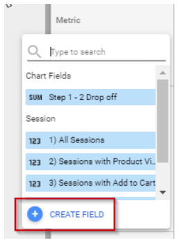
2. Create the calculated field “2) Sessions with Product Views/1) All Sessions” and name the field “Step 1 – 2 Drop off”
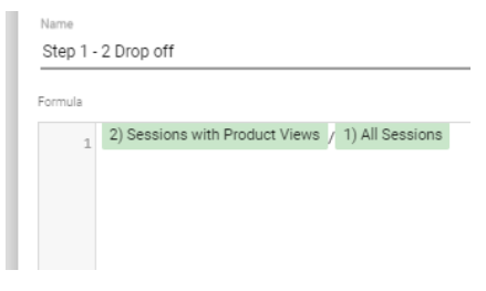
3. Repeat this process for steps 2 through 4.
4. Create arrows for drop off percentages using tools like Canva.com

Step 7: Use the blended datasource values to create calculated drop offs
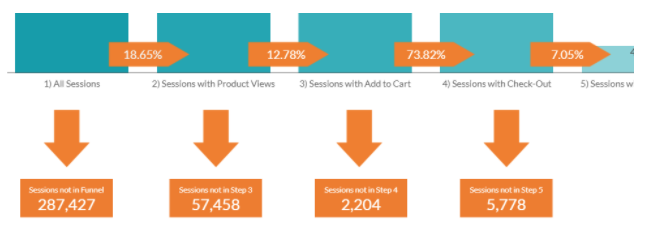
1. Start by copying one of the drop-off percentage summary charts and placing below the “1) All Sessions” bar
2. Create a new field named “Sessions not in Funnel”

3.Use the calculation: “sum(1) All Sessions)-sum(2) Sessions with Product Views)”
4. Repeat calculation with values 2 and 3, 3 and 4, and 4 and 5 as the summed values
Step 8: Use the blended datasource values to create calculated drop off percents
1. Copy the “Sessions not in Funnel” card and create a new calculated field called “Step 1 drop-off Percentage”
2. Use the calculation “1-(sum(2) Sessions with Product Views)/Sum(1) All Sessions))”
3. Repeat calculation with values 3 and 2, 4 and 3, and 5 and 4 as the summed Values
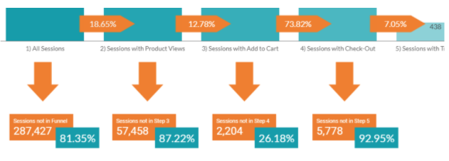
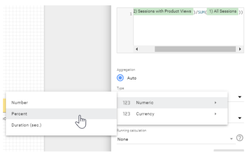
4. Make sure to change the calculation format from numeric to percent
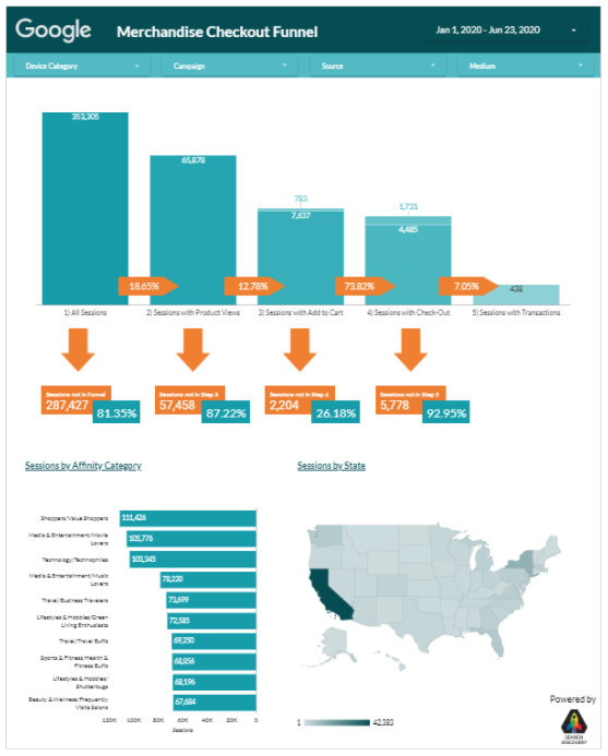
Now you can apply common filters such as Device Category, Campaign, Source and Medium to slice and dice the data. Additionally, there are great out-of-the-box visualizations with the Google Affinity Category and Maps to help bring the data to life.



.png)

